Asana
Celebrating our users
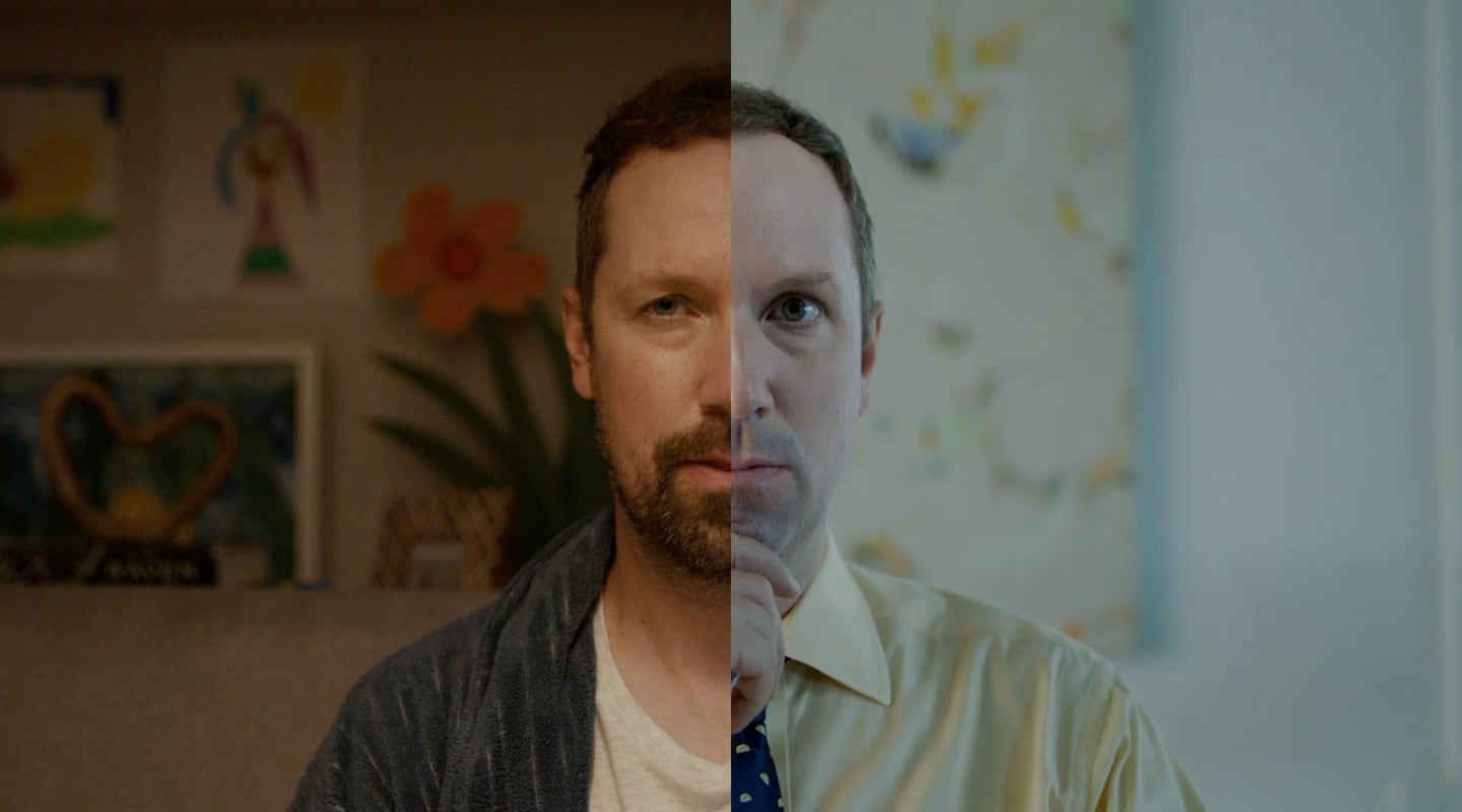
Asana had to evolve from a well‑loved tool used by the creative and design teams into a credible, trusted choice for enterprise‑wide adoption. To do that, we needed to feel bigger while preserving the soft-touch that made people love Asana in the first place.
Asana’s playful visual style had wide appeal, but it wasn’t resonating with enterprise buyers who needed to see a platform built for scale.
Paired with abstract and colorful product UI elements, we shot black‑and-white portraits of real teams (and real Asana users). The campaign helped shift perception of Asana from a quirky design tool to an enterprise-grade collaboration platform.
The work brought emotional depth and visual clarity, helping Asana speak to larger organizations without losing the heart that made it beloved.


Our approach
Real people, getting real work done
We retired playful illustration in favor of striking portraits that highlighted real users and their team dynamics.
Sophistication through contrast
A minimalist black-and-white palette allowed the UI to shine while creating a modern, elevated feel.
A love letter to the hard‑core users
More than a campaign, this was a tribute. By celebrating the ways real people use Asana to move work forward, we reconnected the brand to its most powerful asset: its users.