Paramark
Rigorous data. Fearless creativity. A brand to match.
Paramark is an AI-powered marketing measurement and forecasting platform. It is designed to help CMOs, CFOs, and growth teams measure thetrue impact and ROI of their marketing budgets.
The challenge
A lot of startups claim they can measure how effective your company’s marketing is. But most are astronomically expensive, give you a single report every six months, use outdated and inaccurate measurements like last-click attribution, or just throw you into the deep end with a dashboard to figure out what comes next. Paramark needed to differentiate from the pack, but their offering was technical and their differentiators could be hard to understand if you weren’t already familiar with the space.
Their brand was only exasperating the problem: they looked like
an early-stage analytics tool. Just another B2B SaaS startup.
As Paramark’s founders put it, “We’re going to be a category leader, and we need a brand to match.” That brief was specific enough to anchor everything. It wasn't just about a new startup logo design.
It was about closing the gap between where Paramark was and where it was headed.
Our approach
Data as a canvas,
not a cage.
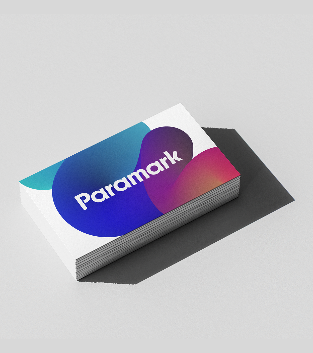
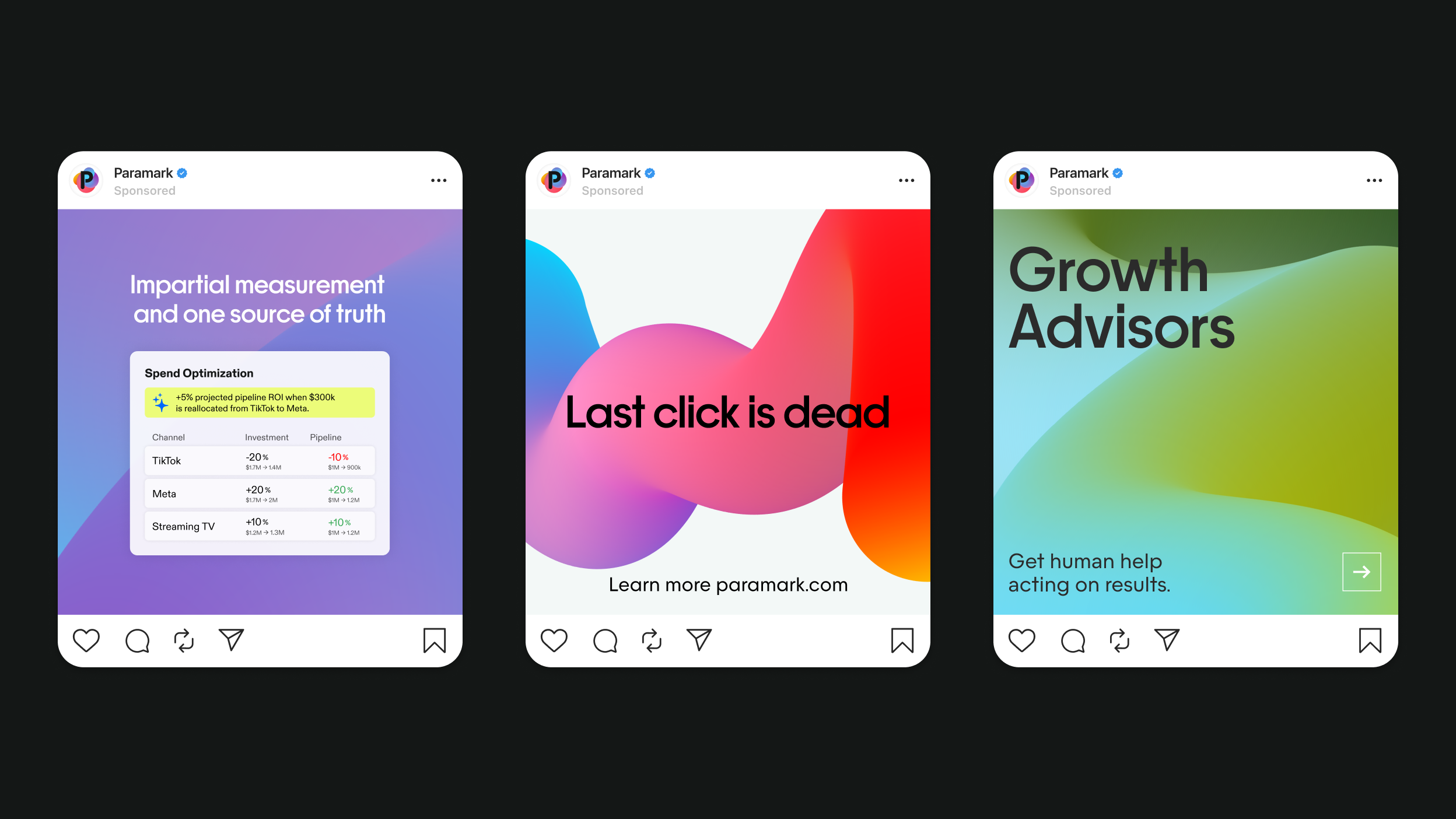
B2B brands tend to skew cold and boring. Paramark wanted the opposite. We built the visual identity around the idea that data could liberate creativity instead of constraining it. The Color Bloom gradient is data visualization that you actually want to look at: fluid organic shapes in a bold, warm palette.
One brand,
two audiences.
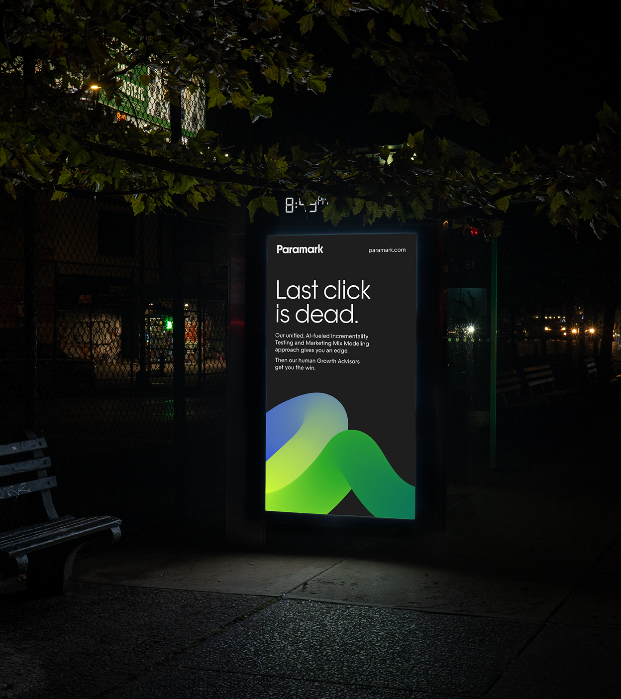
CMOs respond to boldness and aspiration. CFOs respond to credibility and control. Paramark’s brand had to earn both without compromising for either. The Color Blooms lead with warmth and movement. The wordmark and typography stay clean and precise. The copy opens with the CMO’s frustration and closes with the CFO’s proof. Neither audience gets the watered-down version.
Codify the voice before it gets sanded down.
Paramark came with something rare:
a genuine point of view. Frank, bold, and never boring. But what does that actually sound like when you’re writing about marketing mix modeling and incrementality testing? Squero defined four attributes for the Paramark voice - Knowing, Rebel, Enthusiastic, Clear - and applied those to every word of their website.
The work
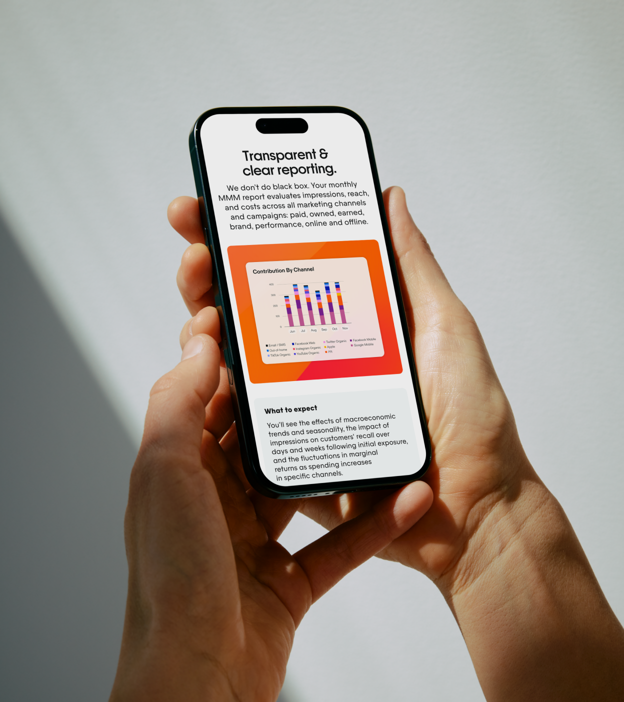
Over 12 weeks, Squero delivered the full foundation. We started with brand positioning and external messaging, a copy deck with headlines, value propositions, and 25, 50, and 100-word descriptors across two audiences. From there: a net-new visual identity (logo, color system, typography, and a custom illustration library), brand guidelines, voice and tone guidelines, four pages of copy, web design and development, sales slide deck design, and an explainer video concept with treatment options at multiple budget levels.
The outcome
Paramark went from looking like just another B2B SaaS startup to a bold, confident, category leader that has something to say and a roadmap that will change everything. That’s already serving them well in investor conversations, enterprise sales meetings and everything in between.

As we expanded from a software solution to an AI agentic platform, we needed a partner who could help our brand evolve with us and look the part of a category leader. Squero was exactly that.
Pranav Piyush, CEO, Paramark

We’ve all gone through rebrands, and the expressions you’ve given us to go forward with are truly incredible. This feels like an achievement of what we set out to achieve: look different, feel different, stand out.
Alex Vicars, Marketing Manager, Paramark