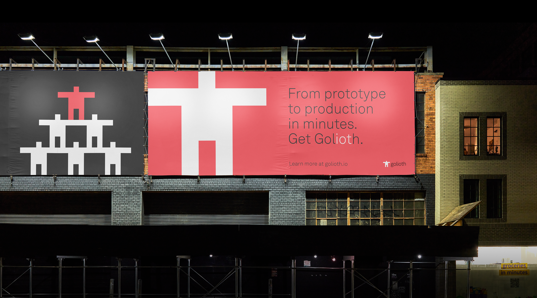
Golioth
Building brand for engineers


The result is a cohesive design system that signals that they bring care and thoughtfulness to every touchpoint, making them look like a mature company even in the early phase of their growth.
Also, it seems interesting. Cool. Memorable.
Engineers like cool shit too.
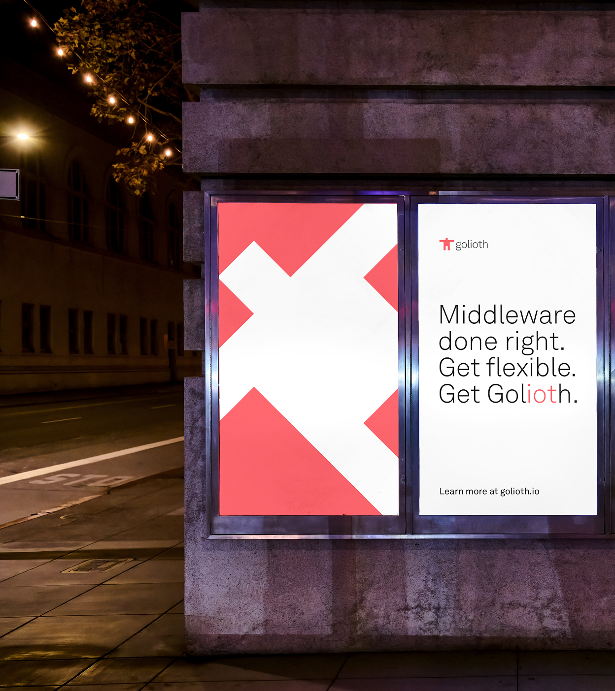

Our approach
A universal symbol
The mark evokes signal, connection, and scale–adaptable across contexts without losing meaning.
Strong color identity
A bold palette and high‑contrast accents establish presence and confidence in a crowded category.
Clearly. Information.
We stripped back complexity to foreground what matters–clarity, speed, and capability.

Since the brand change, traffic to our website has increased 266% month-over-month. People are staying on the website longer, and we’ve even had a meeting conversion off the website, which hasn’t happened to us before.
Ariana Faustini, Head of Global Marketing at Golioth


